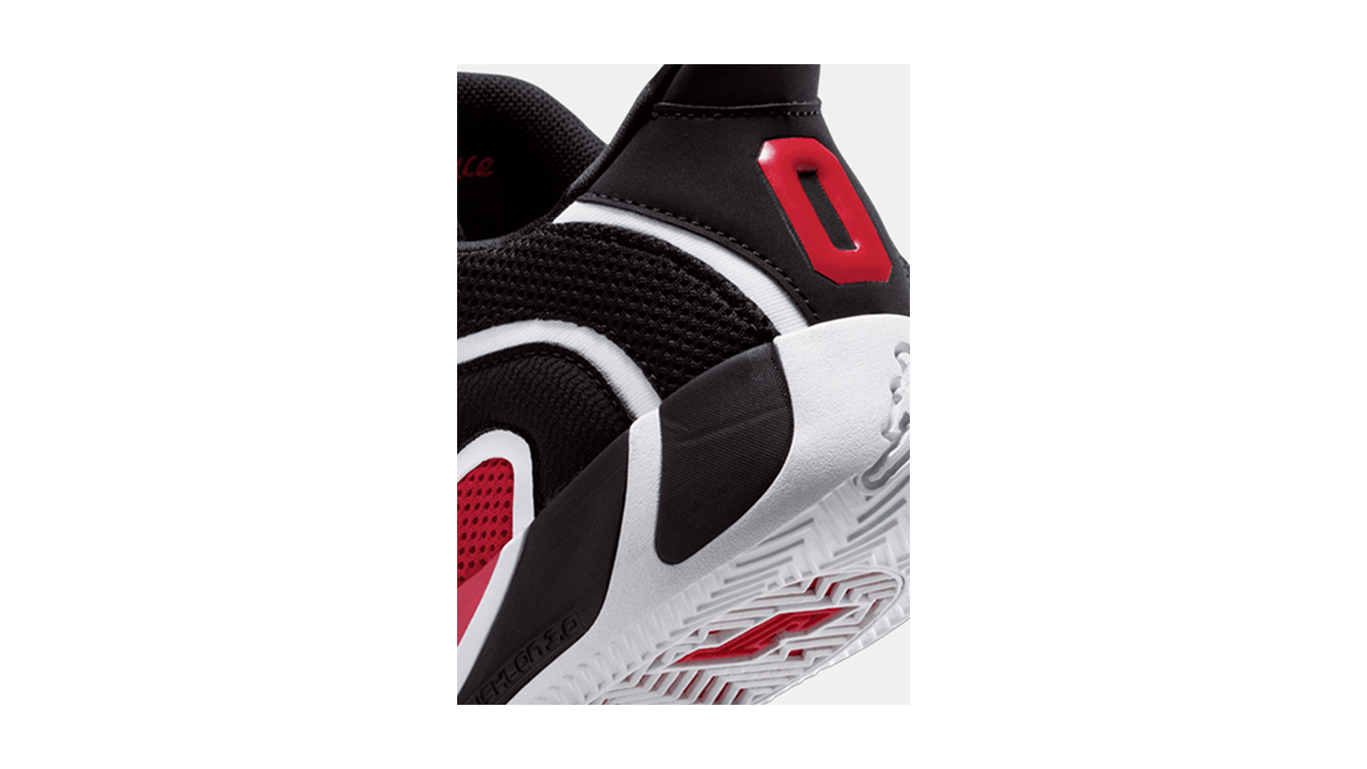
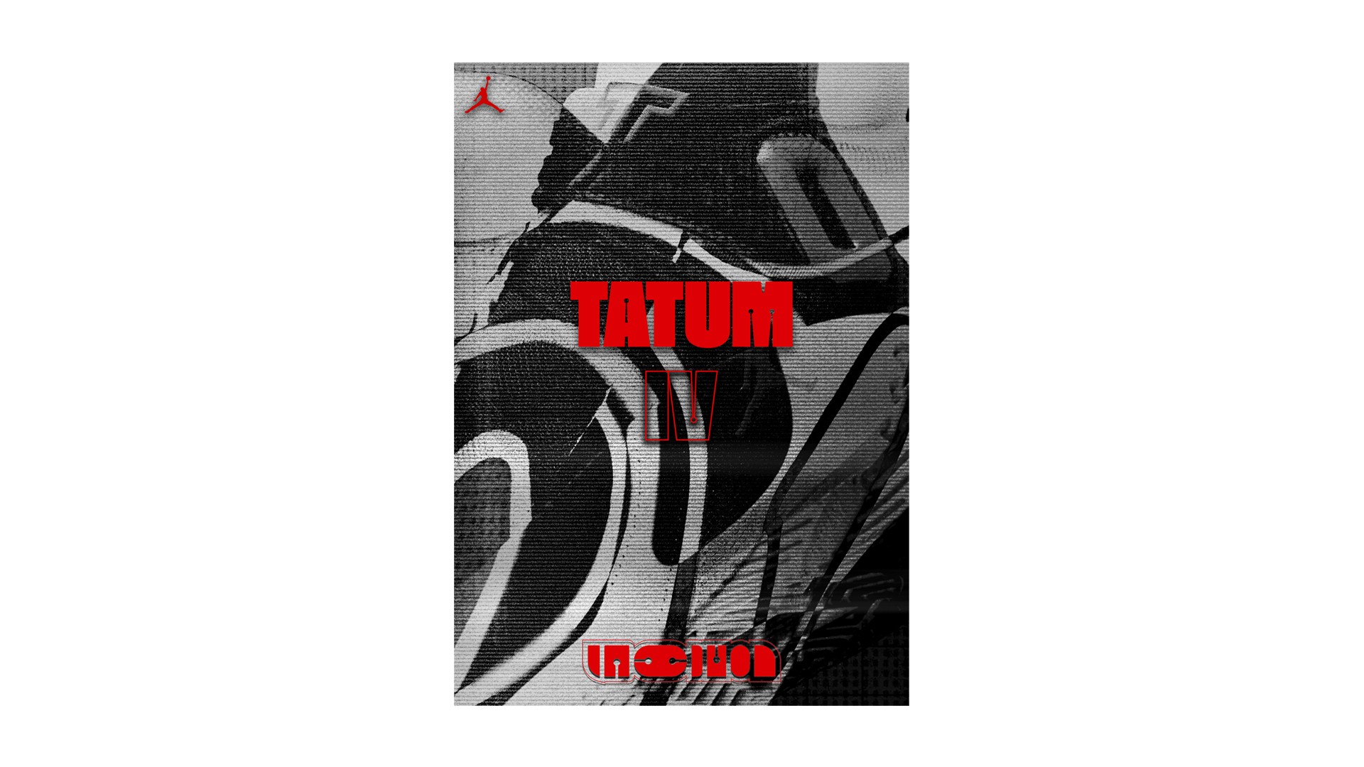
A series of mock-up posters designs to promote the release of the Jordan "Tatum IV".


PROCESS
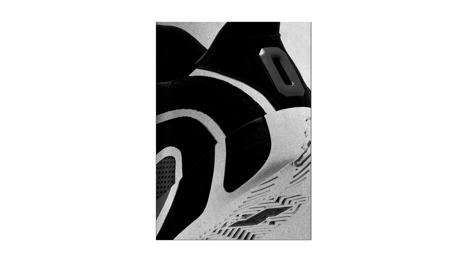
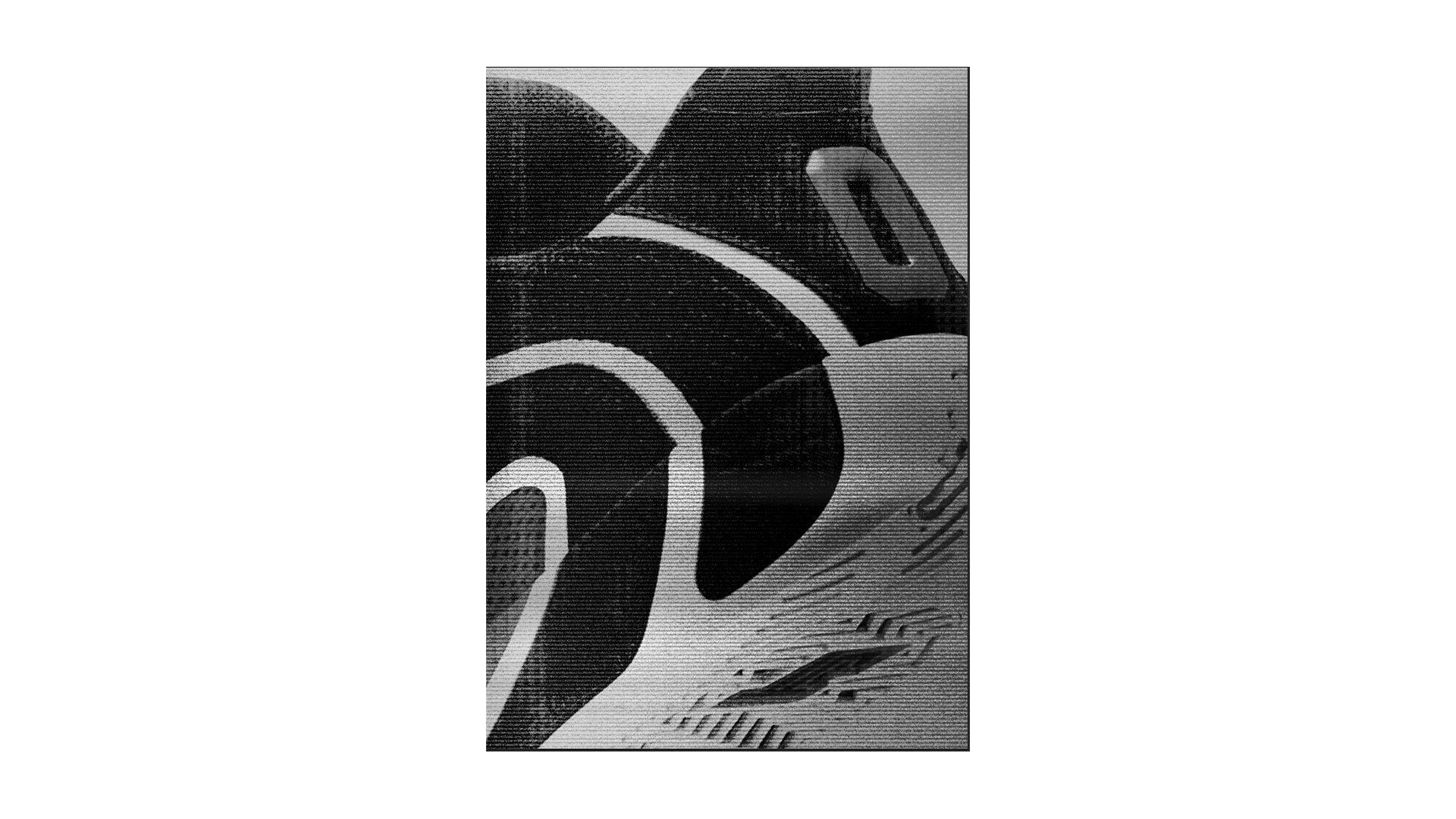
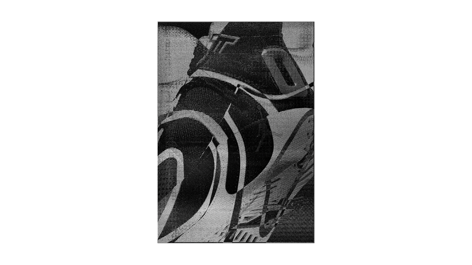
The process involves layering textures through blend mode compositing to create compositions that feel atmospheric and gritty, while remaining bold and engaging through a distinctive use of colour.
SHAPES
The process involves layering textures through blend mode compositing to create compositions that feel atmospheric and gritty, while remaining bold and engaging through a distinctive use of colour.
SHAPES
The reoccurring symbol throughout the posters is built off the back of Old School Graphic font from KiloType.

This font has a unique shape which was the bases for forming these symbols.

The intention was to create more cohesion throughout the design, and strengthen the relationship between the typography and visual elements.


MOCK UPS
The recurring symbol throughout the posters is built from the Old School Graphic font by KiloType.
This font has a unique shape, which served as the basis for forming these symbols.
The intention of creating greater cohesion throughout the design and strengthening the relationship between the typography and the visual elements.
MOCK UPS